
The following guide will examine the stock chart pattern death cross, how to assess the pattern on charts and apply it to your trading strategy, as well as analyze the pros and cons of using this technical analysis tool.
Best Crypto Exchange for Intermediate Traders and Investors
-
Invest in cryptocurrencies and 3,000+ other assets including stocks and precious metals.
-
0% commission on stocks - buy in bulk or just a fraction from as little as $10. Other fees apply. For more information, visit etoro.com/trading/fees.
-
Copy top-performing traders in real time, automatically.
-
eToro USA is registered with FINRA for securities trading.
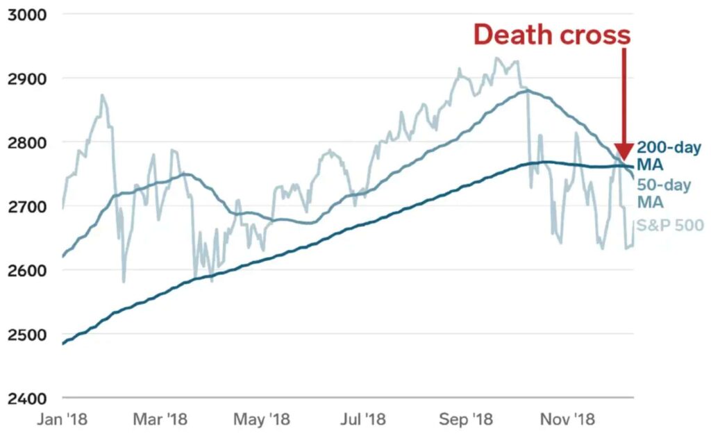
What is a death cross?
The opposite of a death cross pattern is a golden cross, in which a shorter-term MA crosses above a longer-term MA and is typically considered a bullish signal.
Recommended video: What is a Death Cross Chart Pattern and Does it Work
Investing for beginners:
- What is Investing? Putting Money to Work
- 17 Common Investing Mistakes to Avoid
- 15 Top-Rated Investment Books of All Time
- How to Buy Stocks? Complete Beginner’s Guide
- 10 Best Stock Trading Books for Beginners
- 15 Highest-Rated Crypto Books for Beginners
- 6 Basic Rules of Investing
- Dividend Investing for Beginners
- Top 6 Real Estate Investing Books for Beginners
Death cross explained
The occurrence of a death cross involves three phases:
- An uptrend (the shorter-term MA is above the longer-term MA) has reached its peak as buying momentum starts to retract;
- The shorter moving average moves beneath the longer moving average to trigger the emergence of a downtrend;
- The continuation of a downtrend in which the shorter-term MA stays below the longer-term MA.
Both simple moving average (SMA) pairs and exponential moving average (EMA) pairs can be used to signal a death cross. The death cross pattern is usually based on the 50-day MA and the 200-day MA. As longer time frames, the lines are less affected by short-term movements and are, thus, more helpful in gauging long-term market sentiment.
Correspondingly, the 50-day MA is calculated using a much shorter time frame than the 200-day MA, meaning the 50-day average tracks the short-term price more closely than the 200-day average does. Therefore, when the 50-day MA line crosses below the 200-day MA line, short-term momentum can be viewed as declining compared to the last 200 days, suggesting a change in the mid-to-long-term price trend.
Yet, despite the dreaded bearish warning, some traders often welcome the death cross as a lucrative buy opportunity. As the contrarian investment advice goes: “the time to buy is when there’s blood in the streets,” i.e., buy when everyone else is selling.
Death cross timeframes and periods
Nevertheless, traders are not confined to the 50-day and 200-day moving averages. For example, they may opt for timeframes that reflect the previous hours, days, weeks, etc. Generally, larger chart time frames tend to form more robust, lasting breakouts, whereas a one-minute or five-minute chart can provide short-term trade signals and highlight potential short-term changes in direction.
Additionally, the time periods of 200 and 50 can also be altered. The idea is the same. When the shorter-term MA crosses the longer-term one, it may signal that a trend change is underway in that timeframe. Day traders, for example, may find smaller periods, such as the 5-period (e.g., minute) and 15-period moving averages, more helpful in trading intraday death cross breakouts.
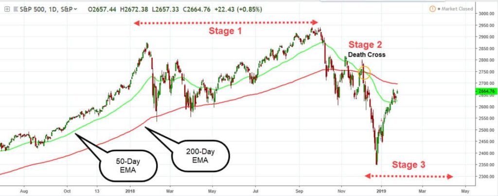
How to spot a death cross?
The first stage presents a weakening uptrend as prices begin to peak, indicating that bearishness may be on the horizon. A death cross example can be observed when the short-term MA crosses below the long-term MA. Then, as sellers gain the upper hand, prices start to fall, and the short-term MA diverges from the long-term MA.
Then, in the second stage, the 50-day MA finally crosses below the 200-day MA signaling a definite downtrend. The divergence between the two moving averages becomes more pronounced as prices decline.
The final stage is marked by a continuing downtrend in which the 50-day MA firmly stays below the 200-day MA. This signals that a downtrend is indeed underway. The new downtrend needs to be sustained for an authentic death cross to have occurred. However, if the period of downward momentum is short-lived and the stock turns back to the upside, the pattern can be considered a false signal.
The death cross typically leads to further selling pressure as traders liquidate their positions in anticipation of further price declines.
Death cross: a lagging indicator
The death cross pattern often occurs after the trend has already shifted from bullish to bearish, i.e., it confirms the occurrence of a trend reversal; it doesn’t predict it. This is because crossovers are based on moving averages, lagging indicators formed on historical data that trail the underlying asset’s price action. So, basing your trading strategy solely on them can result in missed opportunities for profitable trades or mitigating losses.
Therefore, crossover signals should be confirmed by additional technical indicators. For example, since momentum indicators are often leading (i.e., the long-term trend typically dies just before the market turns) rather than lagging, they can assist in overcoming the death cross’s tendency to lag behind price action.
For instance, momentum oscillators like the relative strength index (RSI), moving average convergence divergence (MACD), or the average directional index (ADX) can be used in tandem with the death cross to filter out false signals.
In addition, the death cross pattern gives more reliable signals on long-term trend change when accompanied by heavy trading volume (a graph representing the total number of units being traded). That’s because higher trading volume can typically demonstrate that more investors are acting on a significant trend change signal, seeking to make a profit before a bear market takes over.
Death cross stock trading strategy
Using the death cross trading strategy can help determine a good time to exit a long position or to short a stock, as it indicates a prolonged upmarket has run out of momentum and a security might be entering a bear market.
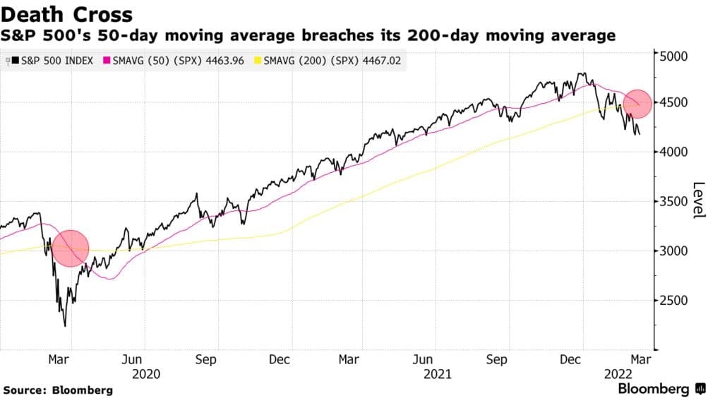
The pattern’s predictive ability is backed by the fact that it has preceded all the severe bear markets of the past century. For example, the S&P 500 formed a death cross on March 30, 2020, during the sell-off caused by the COVID-19 pandemic, as well as in November 1999 at the peak of the dot-com bubble, and in October 2000, once that bubble burst.
Additionally, the S&P 500 formed a death cross in December 2007, just before the global economic meltdown, and in 1929 before the Wall Street crash that led to the Great Depression. According to Fundstrat research cited in “Business Insider,” the S&P 500 has formed death crosses 48 times since 1929.
However, these instances can also count toward sample selection bias, whereby data points are selected to argue toward a predetermined conclusion. In reality, cherry-picking those bear-market years ignores the numerous occasions when the death cross merely signaled a market correction.
For example, according to Fundstrat, the S&P 500 was higher a year after the occurrence of a death cross about two-thirds of the time, averaging a gain of 6.3% over that period. And though well off the yearly yield of 10.05% since 1926, hardly an indicator of a bear market either.
Nonetheless, the death cross does provide a more useful bearish market timing signal when appearing after market losses of over 20% because downward momentum in weak markets can indicate deteriorating price action. But its historical track record suggests the death cross is rather a coincident indicator of market weakness rather than a leading one.
Ultimately, crossovers can merely tell us what we already know, that momentum has shifted and should not be utilized for market timing or predictive purposes. In short, while all big sell-offs in the stock market start with a death cross, not all of them lead to a significant decline in the market.
As a result, we often witness a short sharp rebound from oversold (undervalued) positions, typically much stronger than the pullback from overbought (overvalued) positions. In fact, according to Fundstrat, due to the lagging nature of the death cross signal, it has paid off to buy stocks following a death cross rather than sell them.
Best Crypto Exchange for Intermediate Traders and Investors
-
Invest in cryptocurrencies and 3,000+ other assets including stocks and precious metals.
-
0% commission on stocks - buy in bulk or just a fraction from as little as $10. Other fees apply. For more information, visit etoro.com/trading/fees.
-
Copy top-performing traders in real time, automatically.
-
eToro USA is registered with FINRA for securities trading.
Double death cross
The double death cross strategy employs one more moving average to help you anticipate when the death cross signal will occur. The third moving average is the 100-day MA, a medium-term MA between the other two moving averages. For a double death cross to appear, a short-period moving average (50-day MA) will have to cross below both long-period moving averages (100-day MA and 200-day MA).
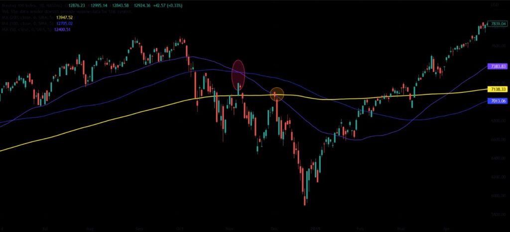
A double death pattern can be seen as a bearish signal, as well as a sign of a market correction. If you believe it to be a bearish signal, you might consider opening a short position using multiple entries. One entry at each death cross (one when the 50-SMA crosses below the 100-SMA and one when the 50-SMA crosses below the 200-SMA) with a stop loss right above the first death cross.
Bitcoin death cross
The Bitcoin (BTC) death cross pattern is formed by the short-term moving average crossing below the long-term moving average. For example, when the 50-day line crosses below it to the downside, short-term momentum is falling against the last 200 days.
In many cases, this translates into a reversal of the long-term price trend. While this chart pattern can signal trouble for long-term Bitcoin investors, it can also present an opportunity to profit from the shift in momentum by buying the asset at a discount.
In September of 2022, Bitcoin’s 20-week MA dropped below the 200-week moving average for the first time. This is particularly noteworthy since Bitcoin’s price doesn’t often near its 200-week MA. Normally, reaching this level meant a period of solid price increases.
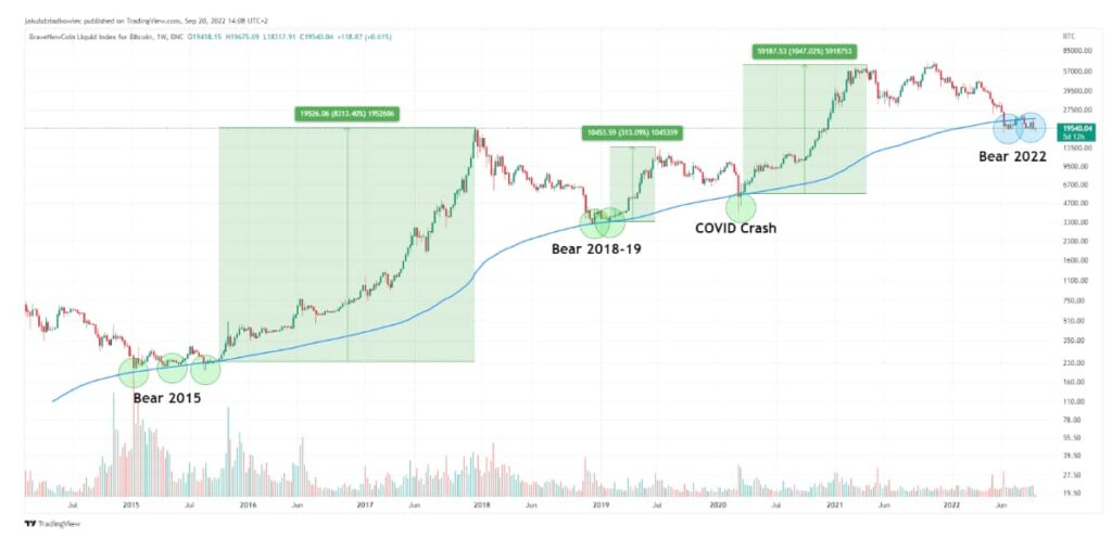
As a result, until recently, it was believed that the 200W MA level was a reliable BTC support level (i.e., the price will not decline after this point), pointing to a lucrative buying opportunity. For example, hitting this area in the past had the price skyrocket:
- 2015: up 8313% from $230;
- 2019: up 313% from $3351;
- 2020 COVID meltdown: up 1047% from $5620.
Pros and cons of using the death cross pattern in stock trading

Pros
- Can substantiate a trend reversal;
- Suitable to any market and timeframe;
- Helps to detect potential exit points as well as shorting opportunities;
- Relatively easy to spot and assess;
- Valuable as a standalone chart pattern or in conjunction with other technical indicators.

Cons
- The death cross is a lagging indicator, providing delayed feedback to the trader;
- Can produce false signals;
- Must be used alongside additional technical signals and indicators to confirm signals;
- For accurate signals, the pattern needs to be accompanied by heavy trading volumes and longer timeframes;
- While the pattern is good at confirming a trend already underway, it can not accurately predict a trend reversal.
In conclusion
Death crosses are powerful trading signals defined by the short-term moving average crossing below a long-term moving average, telling investors that momentum is changing to the downside. Though the financial press often labels the occurrence of a death cross as the harbinger of a recession, in reality, it is usually a better signal of a short-term market slump or price correction.
However, because the death cross can generate false signals and is not an accurate predictive tool, it should always be used in tandem with additional technical analysis instruments rather than as an isolated source of trading information.
Disclaimer: The content on this site should not be considered investment advice. Investing is speculative. When investing, your capital is at risk.
FAQs about the death cross
What is a death cross in stocks?
A death cross is a chart pattern used in technical analysis in which a short-term moving average crosses beneath a long-term moving average, suggesting a potential transition from a bull to a bear market.
What time frames give the most accurate death cross reading?
Typically, larger chart time frames– days, weeks, or months– tend to form more powerful, lasting breakouts.
What are the three phases of a death cross?
The 3 phases of a Death Cross include: firstly, the peak of an uptrend where sellers begin to dominate the market; secondly, the initiation of a downtrend, marked by the shorter-term moving average (MA) crossing beneath the longer-term MA; and finally, the continuation of the downtrend, characterized by the shorter-term MA remaining below the longer-term MA.
What are the limitations of a death cross?
As a lagging indicator, the death cross may provide limited predictive value for traders and be more valuable as confirmation of a downturn rather than as a trend reversal signal.
What does the death cross tell traders?
While a bearish signal, the pattern is often a better indication of a short-term market slump or price correction than the emergence of a bear market or recession. It can help traders determine exit points as well as shorting opportunities.
What is a golden cross?
A golden cross is a chart pattern utilized in technical analysis whereby a long-term moving average crosses over a short-term moving average, indicating a bull market going forward.
How are bearish signals identified in stock trends?
One of the primary bearish signals in stock trends is when the short-term moving average crosses below the long-term moving average. This is referred to as a death cross. A death cross example would be when a 50-day moving average (short-term) crosses below the 200-day moving average (long-term), indicating potential forthcoming bearishness in the stock.
What is the difference between the death cross vs golden cross?
The death cross occurs when a short-term moving average crosses below a long-term moving average, signaling potential bearishness. Conversely, the golden cross happens when the short-term moving average crosses above the long-term one, indicating potential bullishness.
Best Crypto Exchange for Intermediate Traders and Investors
-
Invest in cryptocurrencies and 3,000+ other assets including stocks and precious metals.
-
0% commission on stocks - buy in bulk or just a fraction from as little as $10. Other fees apply. For more information, visit etoro.com/trading/fees.
-
Copy top-performing traders in real time, automatically.
-
eToro USA is registered with FINRA for securities trading.